A Quiet Visit to the English Countryside with Village Green

Impress the gardening committee with a beautifully designed outdoor space destined to win awards with Village Green.
The cozy, relaxing, and beautiful solo games in my collection are just so lovely! Village Green is one such example. I initially expected a lot more squabbling, and possibly even a murder mystery in the countryside, yet it’s all about crafting a space filled with greenery! Gazebos, ponds, flowers, statues, and more make for a peaceful little place.
Game Overview
Game Name: Village Green
Publication Year: 2020
Designer: Peer Sylvester
Artist: Joanna Rosa
Publisher: Osprey Games
Solo Mode: Included in the Base Game
The goal is to set up a 3×3 grid of scenery that aligns with rows and columns of various awards. Placement rules make it rather restrictive when it comes to adjacent card types. Although the neighbors might not hold any grudges, the committee does appear to be very particular!
First Play
June 8, 2021
Complexity
2
Latest Play
April 5, 2026
Expansions
0
Setup Time
Almost None
Lifetime Plays
34
Play Time
10 Minutes
High Score
39
Game Area
24" x 16"
Low Score
11
Relaxing Village Life
There is a lot less conflict in gameplay than the tagline might indicate. It’s all about planning and placing cards and awards, which is a very peaceful sort of experience.
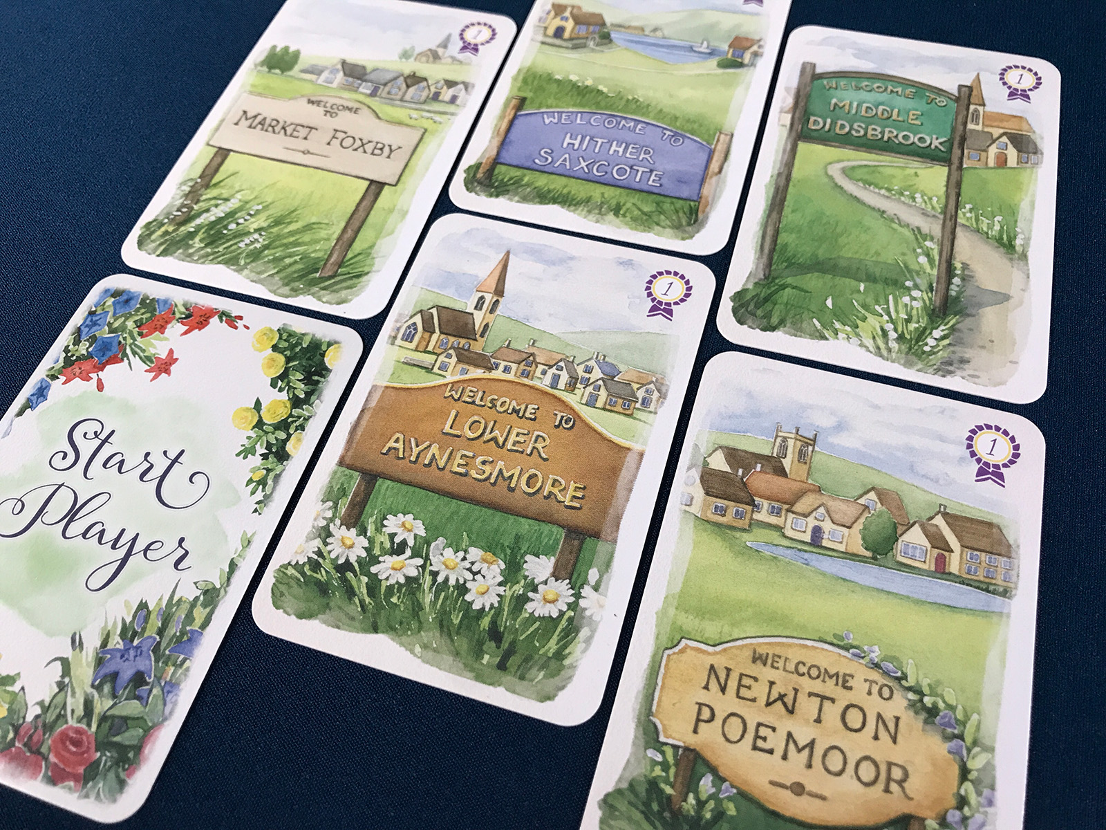
During setup, the not-so-simple decision comes up about which village to utilize. These are all identical from a rules standpoint, but don’t tell me the name isn’t important!
Each one is beautiful in its own way, yet I decided that this would be the time for Middle Didsbrook to shine.
Everything is simply pretty. You can almost hear the bees lazily buzzing and the breeze stirring the wildflowers.
A Simple Beginning
Gameplay begins with a random assortment of 3 awards. An award only applies to the corresponding row or column, which makes planning vitally important.
Gazebos allow awards to be replaced, too, so it’s not like these must be the exact choices. The actual green cards can be very tricky and require strategic adjustments.
This wasn’t a bad starting point, though! I had goals to focus on flowers, trees, and empty spaces.
It’s difficult to maximize all of the available victory points, yet it’s all about figuring out how to build the area.
Award-Winning Green
Such a lovely little area! Card placements aren’t always as easy as it might seem, as they must match the color and / or flower of any adjacent cards. That can get difficult.
Not every card can be placed every time, but I did well! The empty space in the upper right was worth some victory points and also helped match everything around it.
Simply beautiful! I actually did much better than I expected, and pulled off victory points for every award.
Gameplay moved faster than I remembered, too, and I had a feeling of pure joy from admiring the artwork.
Finding the Details
Although some pieces of artwork are repeated or a little similar, there are plenty of unique elements to discover.
I took a moment to find my favorite spot in this green space… There it is! A little pond with ducks and bicyclist in the background is just the most wonderful scene.
This is an example of one of the main issues with the game, though: The yellow flowers. These icons are a nightmare to see from a distance. No contrast!
Fortunately, I’ve gotten better about locating the flowers in the art or the general shapes. The ducks don’t approve.
Contrast and Legibility: Simple and Vital
Not every board game needs to be beautiful, and indeed, when I talk about board game artwork, one of the elements that I don’t always talk about is graphic design. Creating artwork is one thing, but making sure it presents information clearly is something that sometimes seems hidden. Graphic designers deserve a lot of praise for their hard work!
This game is an example of one where I think it missed the mark, unfortunately. Not only are the yellow flower symbols simply terrible to see, but the iconography feels a bit… Unpolished? In particular, the trees look quite unfinished to me and are a little too similar. Such a shame on those misses, because I think this is a wonderful game otherwise.
Graphic design issues can take away from the beauty of the artwork, too. The icons at the bottom of these beautiful illustrations always feel slightly off to me. And I can’t begin to explain how frustrating it is to draw a yellow card and have to constantly hold it a few inches away to see the flower type… Only to second-guess it and look again. And again.
Springtime Blues
Thanks to the order of the cards, I actually managed to create a space that was almost entirely made up of blue flowers! It looked really nice with lots of variety.
My row awards were pretty excellent, but I struggled a bit with the columns. Still hunting for the highest scoring tier! This one is always challenging in a relaxing way.
I also didn’t come across many gazebos, so I was kind of stuck with the initial column awards. Not too bad, though!
This session definitely allowed me to appreciate empty spaces a bit more… Especially when placed in the middle!
Another Favorite Scene
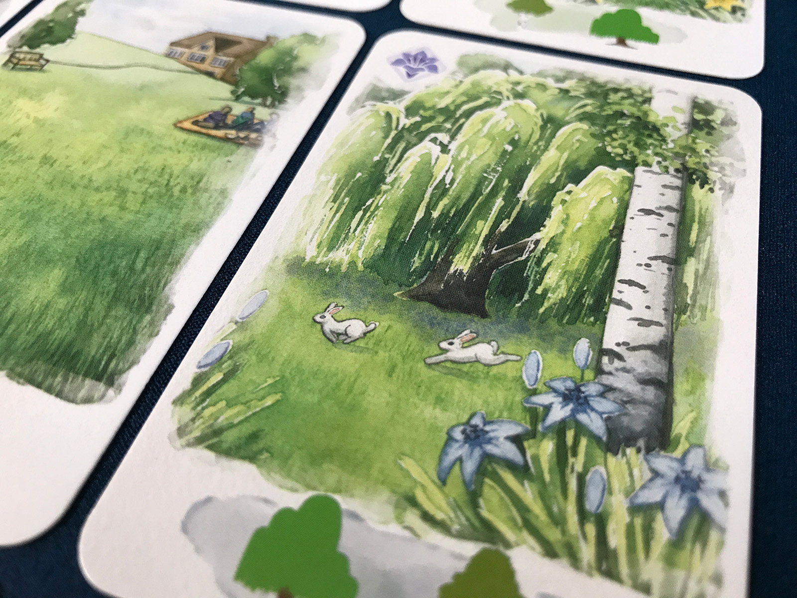
Unsurprisingly, I paused to find the best card in this bunch. A couple of frolicking rabbits won that award!
The problem with the yellow flowers and some of the tree iconography that looks too similar are a real shame. This game has simply gorgeous watercolor artwork.
I continued to play, but let’s just say that Middle Didsbrook did not impress the award committee at all!
Losses aren’t that frustrating, though, as the artwork makes it hard to feel stressed out. I just like to think there really was a murder that caused planting delays. Ha ha!
Session Overview
Play Number: 7-12
Solo Mode: Included in the Base Game
Outcome: 34, 33, 29, 11, 11, 29 (2 Wins & 4 Losses)
So lovely! I ended up with an area almost entirely made up of roses. Still chasing after a high score that might impress the surrounding villages, but I’m content to just enjoy the cozy artwork. This is a fun little puzzle that doesn’t demand too much effort. It’s about making decisions and appreciating the little details. And, if you’re like me, really wondering if Midsomer Murders is going to make an appearance with the award committee. Ha ha!
%
30 Plays
Affordability
Price & Value
9
Functionality
Challenges & Mechanics
10
Originality
Design & Theme
6
Quality
Components & Rules
9
Reusability
Achievement & Enjoyment
9
Variability
Distinctness & Randomness
7
+ Pros (Positives)
- All of the landscape artwork and scenery is absolutely beautiful, creating a relaxing scene of quiet village life.
- Placement restrictions make it very important to plan how to build the grid of green cards with multiple strategies.
- Each award provides a general goal to work towards, and being able to complete many of them feels exciting.
- Gameplay is very quick and mostly boils down to adding to the area or choosing a new award to place.
- The goal is mainly a beat-your-own-score model, yet hitting that top scoring tier is very challenging to achieve.
- Plenty of variety exists not only in the artwork, but in the types of green cards and awards that may be placed.
– Cons (Negatives)
- It is extremely difficult to see the yellow flower iconography on the cards, making these types hard to distinguish.
- A lot of gameplay comes down to relying on luck, although there is a way to clear part of the market once per play.
- Sometimes, making do with what’s available doesn’t actually mean that a great score will be within reach.
- The icons used for the trees look far too similar at times, and it can be tricky to realize there are 3 different trees.
Victory Conditions
Score 30+ Points
- Overall Goal Progress 75%
Goals and Milestones
Score at least 25 points.
Score at least 30 points.
Score at least 35 points.
Score at least 40 points.
Continue the Conversation
What do you like about Village Green? I simply adore the artwork! Have you had a particularly great play with a combination of awards? There is something very calming about this puzzle, despite the fact that I don’t always score that well. Aside from the nearly invisible yellow flowers, this is all about the charm and beauty of the countryside!


Basically, this game is beautiful to look at, but hard to play because of the graphic dsesign goofs that should have been spotted and resolved before the game was released. In my game library, it competes with Sunset Over Water or Floriferous even if it has very different mechanisms compared to these two. I feel like I am more likely to put these on the table than Village Green because of its straightforward readability.
Still, the game is very enjoyable for me, the challenge/puzzle is there and the theme very well translated into the game.
Those are some excellent game choices. Ha ha! Readability is hugely important in any game, particularly in the relaxing genre. Having as little stress as possible is ideal! It’s a wonderful little game that likely would have done a lot better had those graphic design concerns been addressed early on. Hopefully, these sorts of issues won’t pop up in that many other future games!
And when I eventually receive Snowfall over Mountains and Sunrise at the studio, the competiyion will even be fiercer.
Alas, it won’t be tomorrow !
But honestly I was so so glad when I discovered the news of the upcoming Kickstarter last week (I know, I was late to get the news) !
So glad you’re excited! I can say that’s pretty much all I’ve been working on this week… Nothing public yet, but things are definitely taking shape and I hope to share some news soon regarding the timing of the Kickstarter. It’s all looking awesome and I’m so thankful for the people I work with!
Ahah ! Keep up the good work ! I will keep my wallet on the ready. I’m glad to learn you feel your dedicated work will make a difference to your coworkers.
Thank you kindly!